Wednesday
Aug042010

To Cliché, or Not to Cliché...

After seeing a post by a friend about design clichés, it got me thinking. As a designer, we tend to see similar solutions to design problems pretty often. And it’s easy to get jaded about these solutions when you see them all the time.

The question I have is, are these design clichés really a cliché to the target audience? Isn’t the audience the important thing?

For example, I was tasked to design a logo for the local chapter of the American Marketing Association (AMA). After toiling over the content for the logo, I eventually decided to include a sun in the logo. Is it cliché to have a sun in something relating to Phoenix? Heck ya! But I decided to use the motif because the logo will be seen by other chapters in other cities and the logo should have some visual reference to Phoenix. I resisted it. I tried to come up with alternatives but ultimately decided it was better to have a cliché that people understood than to break convention and have people confused. Ironically the client then asked me to use a graphical treatment which I felt was cliché. I resisted that one as well but ultimately gave the client what they requested and I think the end result came out pretty well.

Why do some designers embrace standards yet feel like they’re cheating if they don’t reinvent the wheel every time?

You know what I mean? Like, you should always put a search box in the upper-right corner of a website. Or a form field label should always be below the field. Or your home button should always be in the top left corner of a website. Aren’t those all design clichés? They are…but with good reasoning behind them.

To quote a lyric by Lloyd Cole, “the reason it’s a cliché is because it’s true”.

This also came up with another designer friend who was designing a marketing campaign for Arizona Tourism. He was told by the client, “we’re tired of the Grand Canyon”. Sure, they were tired of seeing the Grand Canyon in all their marketing materials but when your target audience hasn’t seen all those materials and your target audience is VERY interested in the Grand Canyon, maybe the Grand Canyon isn’t such a bad idea.

So, what do you think? Should we as designers always avoid any possibility of clichés or is there a balance between a good cliché and a bad cliché? Lemme know your thoughts…

Here’s that Lloyd Cole song for you to enjoy…

Wednesday
Jun022010

Bravoforté Business Cards

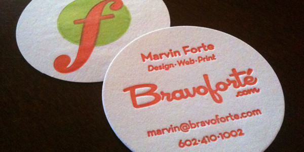
My brand-spanking-new business cards have arrived! Woot!

I just love them. Check out the little bit of debossing on the front. I’ve got the forte symbol on the back, which is appropriate since I am a musician too (it means loud or strong in musical terms).

The cards were printed on a letterpress, thanks to my friend, the super-talented Jon Arvizu (Trapdoor Studio). We printed them at his studio on his antique treadle letterpress…that’s right, human-powered printing. Now that’s green. I chose a 2 inch circle for a few reasons: First, it’s small and doesn’t use much paper. Second, it’s distinctive but still fits in a business card sleeve, in case someone wants to keep it. Third, it’s just darn cute.

The card prints 2/1 (that’s two colors on one side and one color on the other for not printing folk). It’s a one-color press, so we did three press runs, on three separate days. Once they were printed, I had my friends at Southwest Foil and Embossing handle the die-cutting for me and voila, cards.

I have heard comparisons to a coaster for a shot glass, a poker chip, Pogs and even pasties (which caused my mind to wander about a possible promotional photo…but I digress). Of course, those pasties are not to be confused with one of my favorite snacks, the delicious pasty, which looks nothing like my card. If you are interested in the edible type, I recommend the Cornish Pasty Company in Tempe and Mesa, AZ but once again, I digress.

Here’s some video of Jon and I running the letterpress. Some of the clips were shot on my iPhone and some on my Flip.


Letterpress Printing of Bravoforté Business Cards from Marvin Forte on Vimeo.

Let me know your thoughts. Are you a letterpress fan? Do you hate odd-shaped cards? Do you like pasties?

Thursday
May272010

Custom iPhone Case

I just got a cool new iPhone case from Uncommon. They custom imprint iPhone and iPod Touch cases. You can use your own artwork or choose from their large selection online. They use a 3D TATT™ (Thermo-Active Transdermal Technology) printing process which embeds the ink into the plastic, so it’s not prone to just scratching off.

I uploaded some artwork that I created for a skateboard deck (see All Decks on Hand) to their site, which gave me the option to resize the artwork and position it on the case using some very cool AJAX JavaScript goodness. Really well done site with some interesting user interface design.

Here’s the back of the new case:

And here’s the front, with custom wallpaper to match:

The case is made of a hard, glossy plastic. Very good quality. It features cutouts for the vibrate switch, headphone jack, camera and data port. It has small buttons to transfer power and volume settings. The printing quality is exceptional and very high resolution. There’s no discernible dot pattern or screen, even with a loupe. It took about a week for me to get mine, with shipping. Cost is $39.95 plus shipping.

I highly recommend this product, if you’re interested in a case that’s unique and one-of-a-kind, check out www.getuncommon.com.

Tuesday
Mar302010

Trust Your Gut at Ignite Phoenix 6

On March 30, 2010, I spoke at Ignite Phoenix 6 at the Mesa Arts Center in Mesa, AZ. The subject of my talk was “Trust Your Gut”, a subject I am pretty passionate about.

Click to read more ...

Tuesday
Mar162010

Hyphens, En Dashes and Em Dashes (Don’t Let Friends Dash Incorrectly)

Hyphens, em dashes and en dashes, what’s the difference and which one should I use? Follow these basic grammatical guidelines and your copy will be the better for it.

Click to read more ...

Sunday
Mar142010

Two Spaces After a Period?

This debate marches on, even today when updated information is so readily available. Yes, your high school typing teacher was misguided: two spaces after a period is not really a good practice. I will stop short of saying it’s “wrong” because ultimately, it’s a style decision. If you really like the way two spaces looks, have at it! But I am likely to disagree with you. [grin]

Click to read more ...

Wednesday
Jan202010

Famous Bass Players who use [gasp!] a pick.

An audience member came up to compliment me on my bass playing after a show I played a couple of weeks ago. He commented on the fact that I used a pick most of the night and said “isn’t that unsusual?”. I replied “not really, did you know that Paul McCartney used a pick on nearly all The Beatles records?” He was surprised.

Click to read more ...

Thursday
Aug132009

Is Advertising Dead?

I saw this video and it got me thinking, is conventional advertising really dead?

Consumers are skeptical of traditional brand messaging. They are relying more and more on referrals from friends or even strangers, on sites like facebook, Yelp and Angie's List. The video does a great job at demonstrating why the old way of doing things isn't working as well anymore. It's time for companies to approach marketing in a new way, they need to engage their clients: interact, listen and communicate, rather than dictate.

Do I really believe conventional advertising is dead? No, but I do believe it must change. Otherwise, it is possible that it could go the way of the dinosaur. 

What do you think? Do you trust advertising? How do you decide where to spend your money?

For more insights on conventional advertising and social media, check out Groundswell by Charlene Li and Josh Bernoff.